How to Read a Bitcoin Chart

If you are new to crypto read this article!
There are many things to remember when reading and understanding Bitcoin charts. In this article, we will discuss some of the basics of Bitcoin charts.
Bitcoin chart basics
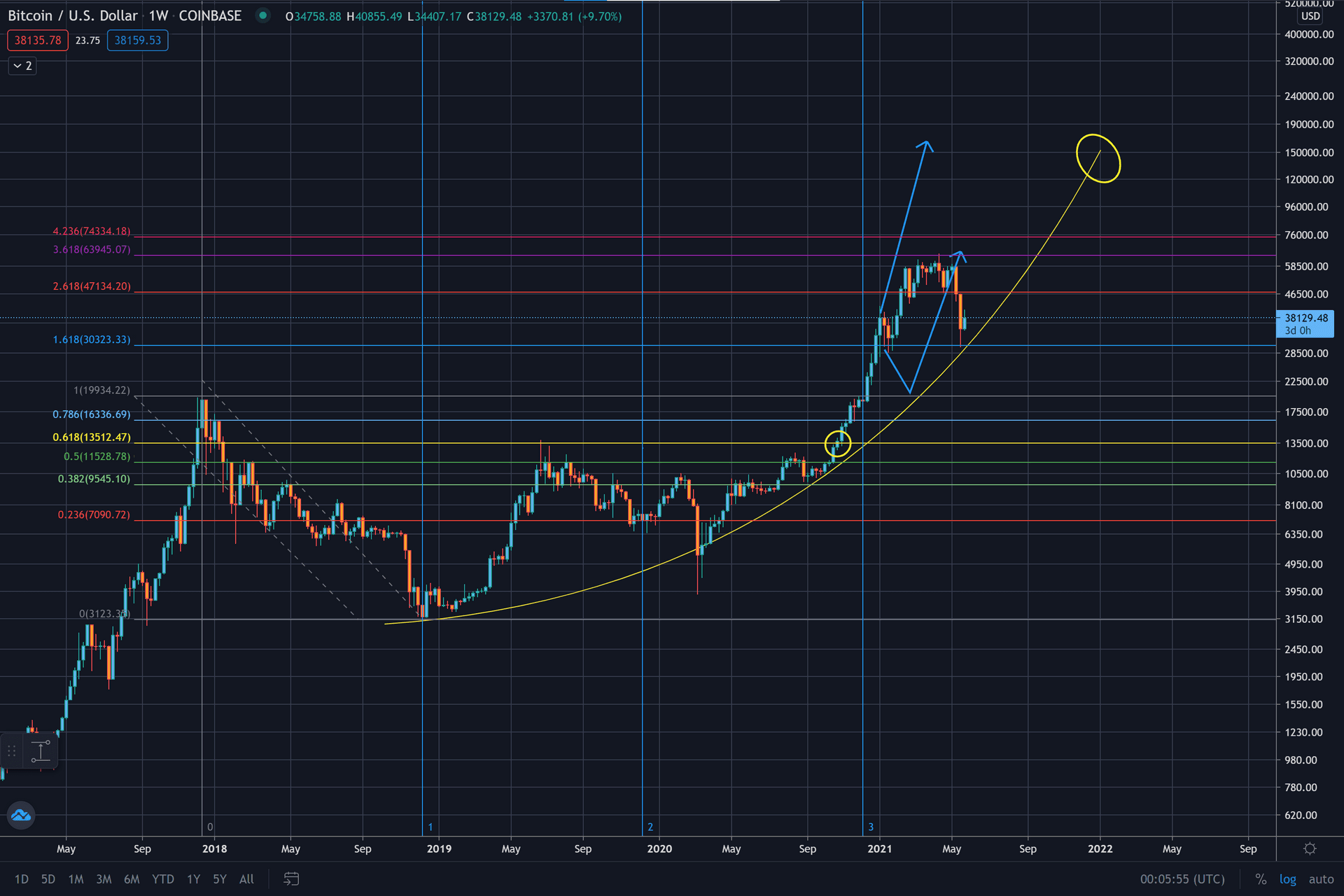
A Bitcoin chart in simple terms is a graphic depiction of the exchange rates of Bitcoin from one financial asset or currency to another. When looking at price charts, they reveal important information about the entire history of Bitcoin’s fluctuating price. With different exchanges, the price of Bitcoin varies but one thing remains constant: Bitcoin charts are absolutely necessary for traders and investors to help decide how they want to interact with the market. Bitcoin charts provide crucial information to not only trace Bitcoin’s present but also historic prices. Charts often display the exchange rate of Bitcoin to either a flat currency or another cryptocurrency. For a new investor, reading and understanding a Bitcoin chart may seem daunting but if you learn to read between the lines, you can begin to recognize opportunities, trends and patterns that will help further explain price movements and historical data. Along with understanding how charts are broken down, understanding the cyclical patterns in the price action of Bitcoin helps investors learn movements in the fluctuating prices. It's important to remember that getting involved in the market based solely on price action does not take Bitcoin's fundamental value into consideration. Technical analysis does provide traceable evidence of Bitcoin’s worth but acclaimed investors have often criticized the style of analysis as misleading or “pseudoscience”.
Light the way with candlesticks
Hundreds of years ago, the concept of candlesticks was used by Japanese farmers to track and manage rice trading. In the cryptocurrency market, candlesticks show the open and close prices, as well as the highest and lowest price of an asset during a specific timeframe which is indicative of how traders perceive the market value. Candlesticks are often dedicated in green and red, but traders can also set their own color preference. A red candlestick represents a specific time interval where the closing price of thecandle was below the open price. A green candlestick represents a time interval when the price went up, and the closing price was higher than the open price. You can also choose the view of the candlesticks to an hourly candlestick Bitcoin chart for any particular day. The candlesticks will express the price action per hour, meaning the perpendicular length of each candle will correlate to the hour. Next we will discuss the open and close prices.
Open & close prices
Open price — With the open price of Bitcoin during a specific trading period, it can be found at either the top or the bottom of a candle (not to be confused with the top or bottom of a wick). You can find the location of the open price based on the color of the candle. An example would be if the candle is green, the open price is at the bottom of the candle because green indicates positive price action. Also, important to note, if the candlestick is red, the open price is at the top of the candle because the negative price action took place. Close price — Conversely, when discussing the close price, the close price of Bitcoin during a specific trading timeframe is found at either the top or the bottom of a candle depending on whether the price has moved upwards or downwards. The close price refers to the last price at which an asset was previously traded at. Therefore, it becomes the next trading period's open price at the given exchange. Wicks — Depending on the candle, it may not have upper or lower wicks. A longer upper wick or lower wick indicates that the market price was once trading outside the candle's range but then had retracted back into the candle body to close.
The three phases of market trends
- Accumulation phase: This period is when knowledgeable investors start to buy or sell Bitcoin against the general perception of the market. While in this phase, the price of an asset does not change much because knowledgeable investors are in the minority.
- Absorption phase: The market does eventually catch on to the intelligent investors, and they tend to follow their trend. More people follow these trends until rampant speculation then begins.
- Distribution phase: Then after huge speculation, because of the limited supply of Bitcoin, the price begins to retrace as the knowledgeable investors begin to distribute their holdings to the market. As a result of this, the prices start to fall alongside the volume.
Understanding common patterns in Bitcoin
Common patterns form in price charts over time, patterns tend to form as the price action begins to symbolize common shapes. These shapes have a meaning as well as significance attached to their occurrence. The recurring market movements (shapes) are often key indicators used by traders and investors to decide when to either enter or exit a specific market. Over time, patterns tend to repeat themselves and have shown that recognizable shapes frequently produce similar outcomes. An example would be that some patterns indicate the likely continuation of a certain price trend, while some others indicate the probability of a reversal. When looking at patterns, they are often very helpful to assist traders while deciding when to buy or sell according to support and resistance levels. With support levels, they are found where price tests a certain low on one or more occasions and typically does not break that price level for a prolonged period. With established support, as the price nears support, buying becomes a more common occurrence than selling, thus symbolizing the market's level of demand for Bitcoin. It’s important to remember that rather than prices moving in a bullish direction, support levels can also break to create a bearish trend. In such cases, a new support line is established.
Final takeaway
With some of the material covered in this piece, learning about what to look for in Bitcoin charts is imperative to understanding the markets' varying climates. Although even with all the knowledge available, charts cannot guarantee results when it comes to buying or trading Bitcoin. Certain patterns can correlate with certain outcomes and there is the chance that other market-related factors can lead to alternative price action. Having a deep knowledge of the industry can certainly help but with the volatility of Bitcoin and all other cryptocurrencies, even with there being various advanced charting systems available, it's important to consider risk management while engaging in speculative trade setups.
Most Recent

6 Reasons Why HODL Is So Last Bull Run
Ashley E. Shiver - May 18, 2024

Bitcoin Halving Explained
Ashley E. Shiver - Apr 24, 2024

7 Ways Business Owners Can Utilize Cryptocurrency to Enhance Operations
Ashley E. Shiver - Apr 24, 2024

Embracing the Future: Algorithm Intelligence
Ashley E. Shiver - Apr 24, 2024

Enterprise Solutions
Ashley E. Shiver - Apr 9, 2024

Killer Whale Portfolio Management Service
Ashley E. Shiver - Apr 9, 2024
Stay Up To Date
Get weekly insights and updates from the Killer Whale Crew
Categories
Start Trading
Large Cap
strategy
Trade Duration
Trade Frequency
Gain ETH
strategy
Trade Duration
Trade Frequency
Gain BTC
strategy
Trade Duration
Trade Frequency
Pro
strategy
Trade Duration
Trade Frequency